|
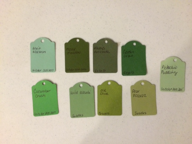
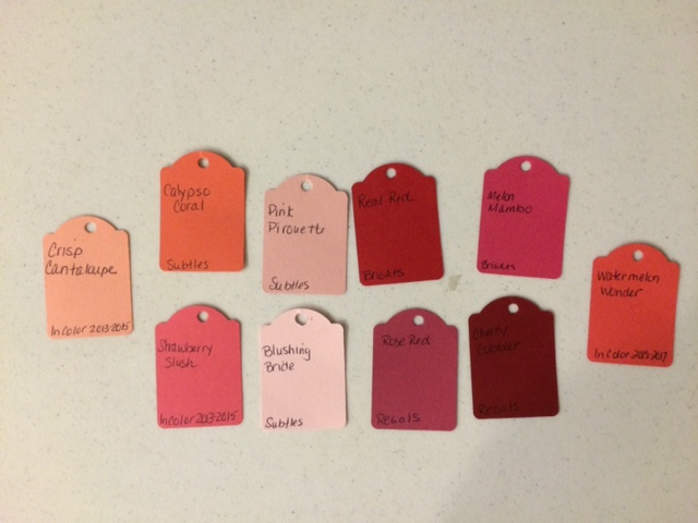
Do you often look at a color and think it is really close to a color you already have? Sometimes you really need to see colors side by side to notices the difference. Below is a picture of Stampin Up current colors starting on June 2nd. From the top row down: Brights: Bermuda Bay, Daffodil Delight, Melon Mambo, Old Olive, Pacific Point, Pumpkin Pie, Real Red, Rich Razzleberry, Tangerine Tango and Tempting Turquoise Neutrals: Basic Black, Basic Gray, Chocolate Chip Crumb Cake, Early Espresso, Sahara Sand, Smoky Slate, Soft Suede, Very Vanilla and Whisper White Regals: Always Artichoke, Cajun Craze, Cherry Cobbler, Crushed Curry, Elegant Eggplant, Garden Green, Island Indigo, Night of Navy, Perfect Plum and Rose Red Subtles: Blushing Bride, Calypso Coral, Marina Mist, Pear Pizzazz, Pink Piourette, Pool Party, So Saffron, Soft Sky, Wild Wasabi, Wisteria Wonder 2014-2016 In Colors: Blackberry Bliss, Hello Honey, Lost Lagoon, Mossy Meadow and Tangelo Twist 2015-2017 In Colors: Cucumber Crush, Delightful Dijon, Mint Macaron, Tip Top Taupe and Watermelon Wonder 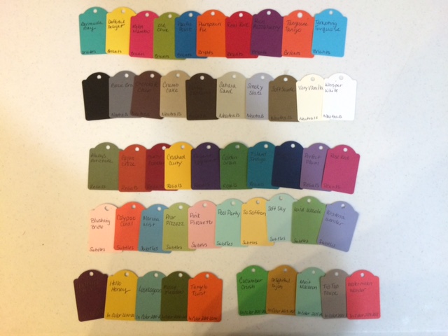 I have heard from a few that they felt as though the new 2015-2017 In Colors are very similar to colors we currently sell. And I as I mentioned above sometimes you need to see colors side by side to truly see how different they are. The following pictures compare the new In Colors to our current colors. I hope I've helped you in your future color choices.
I look forward to hearing from you Steph
0 Comments
Leave a Reply. |
New 2023-2024 Stampin Up Annual Catalog
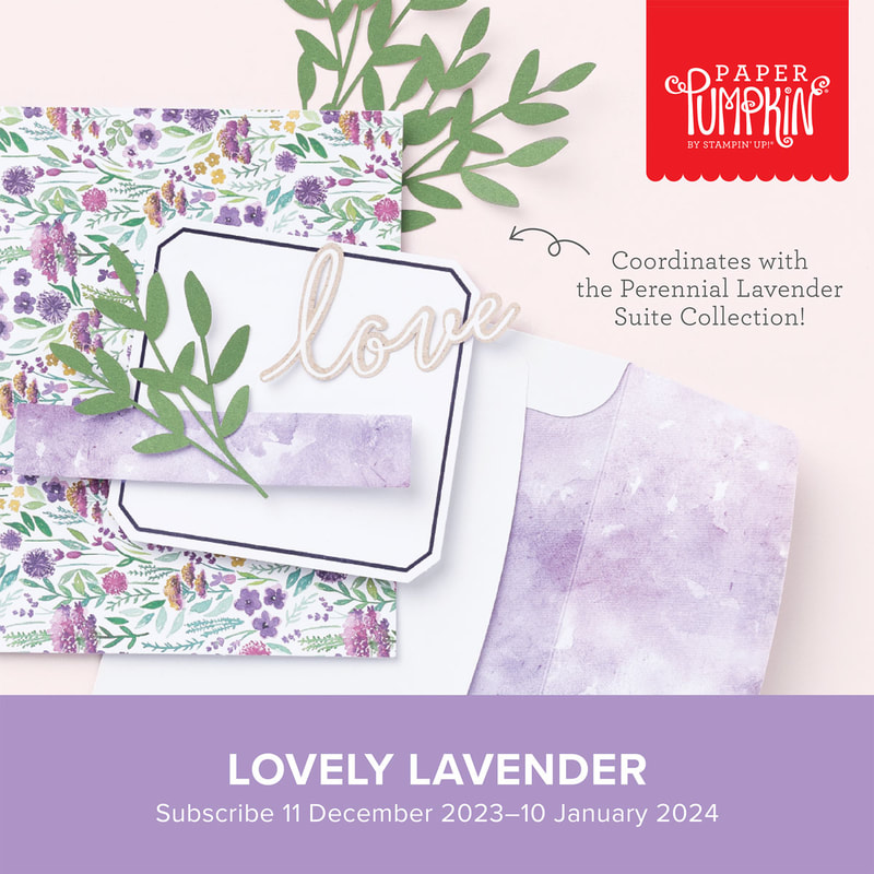
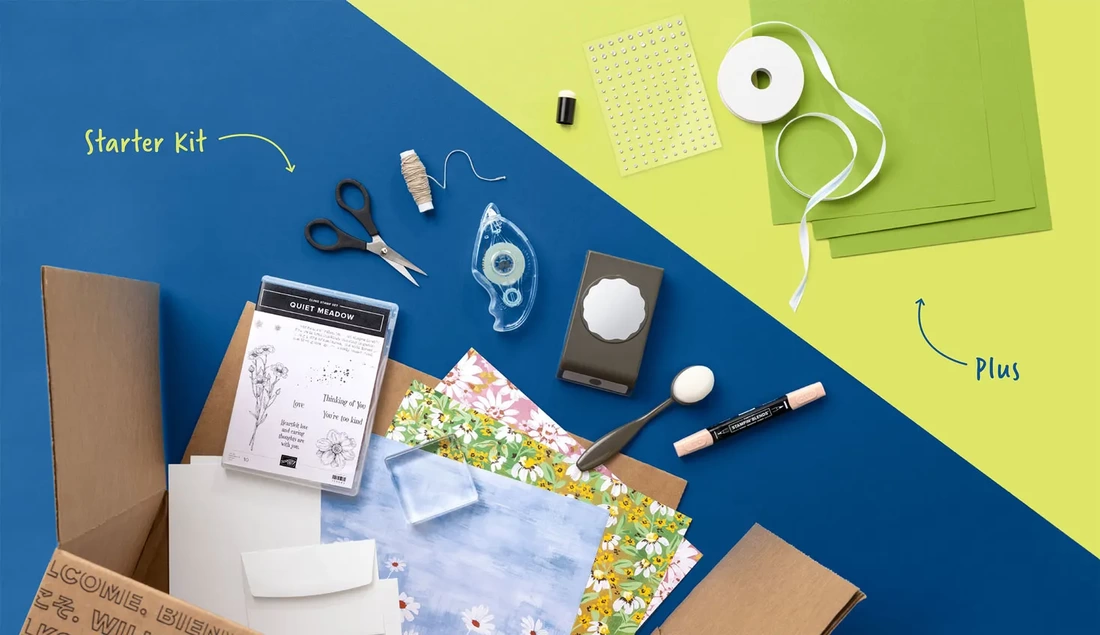
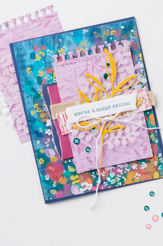
Kits Collection
Join today
Categories
All
Archives
January 2024
|


 RSS Feed